Author Topic: OutpostHD Graphics  (Read 59096 times)

Offline dave_erald

  • Sr. Member
  • ****
  • Posts: 262
Re: OutpostHD Graphics
« Reply #50 on: August 05, 2017, 06:35:51 PM »
All though outline on everything would be an extra pain in the arse I think it helps define everything much better, especially considering the size of the graphics that will be on screen
-David R.V.

-GMT400 fan
-OPU Influencer

Offline White Claw

  • Hero Member
  • *****
  • Posts: 854
Re: OutpostHD Graphics
« Reply #51 on: August 05, 2017, 06:45:18 PM »
Out of curiosity, I just did the agridome too. I put these both these files through the same post processing, except one is with the outline and the other is not.

Also, I've included the previous pic that did not go through any post processing.
« Last Edit: August 05, 2017, 06:47:13 PM by White Claw »

Offline Hooman

  • Administrator
  • Hero Member
  • *****
  • Posts: 4955
Re: OutpostHD Graphics
« Reply #52 on: August 05, 2017, 08:21:43 PM »
The effect is less obvious on this one. I suppose the vegetation has less hard edges. Still though, I like it.

Offline leeor_net

  • Administrator
  • Hero Member
  • *****
  • Posts: 2352
  • OPHD Lead Developer
    • LairWorks Entertainment
Re: OutpostHD Graphics
« Reply #53 on: August 05, 2017, 08:57:03 PM »
The construction site in-game with both versions. Upper most is without outlining, bottom is with.

The effect is subtle but it's lightyears better.


Offline Hooman

  • Administrator
  • Hero Member
  • *****
  • Posts: 4955
Re: OutpostHD Graphics
« Reply #54 on: August 05, 2017, 09:52:50 PM »
Indeed, that does look better.


Something I can't ignore now, the tube and robot icons at the bottom of the interface could use a resolution facelift. They look out of place in comparison to the rest.

Offline leeor_net

  • Administrator
  • Hero Member
  • *****
  • Posts: 2352
  • OPHD Lead Developer
    • LairWorks Entertainment
Re: OutpostHD Graphics
« Reply #55 on: August 05, 2017, 10:10:09 PM »
Tube icons are actually the same as the buildings.

Robots though -- that much is true. I wanted some icons that were easier to see -- when the other robot visuals are replaced I'll replace those as well.


EDIT:

All updated visuals as they look in game now.

« Last Edit: August 05, 2017, 10:18:04 PM by leeor_net »

Offline Vagabond

  • Global Moderator
  • Hero Member
  • *****
  • Posts: 1015
Re: OutpostHD Graphics
« Reply #56 on: August 06, 2017, 05:35:46 AM »
White Claw,

New command site looks awesome! Nice work!

-Brett

Offline White Claw

  • Hero Member
  • *****
  • Posts: 854
Re: OutpostHD Graphics
« Reply #57 on: August 06, 2017, 04:52:48 PM »
New command site looks awesome! Nice work!

Thanks! :D


I did some work today on lander concepts. Which style is looking more promising?


Offline lordpalandus

  • Banned
  • Hero Member
  • *****
  • Posts: 825
Re: OutpostHD Graphics
« Reply #58 on: August 06, 2017, 05:27:39 PM »
The second one. It looks more stable (stable as in the landing gear), functional and practical. Why have 4 ramps, when only one is really needed?
Currently working on Cataclysm of Chaos, Remade.
Link to OPU page = http://forum.outpost2.net/index.php/topic,6073.0.html

Offline lhark

  • Newbie
  • *
  • Posts: 11
Re: OutpostHD Graphics
« Reply #59 on: August 06, 2017, 05:32:05 PM »
A symmetrical design might be more balanced. Also it needs to be able to unload 3 robots and a lot of building material autonomously.
To me multiple ramps make that easier.

Also I like symmetry :p

Offline White Claw

  • Hero Member
  • *****
  • Posts: 854
Re: OutpostHD Graphics
« Reply #60 on: August 06, 2017, 06:14:38 PM »
There's also a middle ground.


Offline leeor_net

  • Administrator
  • Hero Member
  • *****
  • Posts: 2352
  • OPHD Lead Developer
    • LairWorks Entertainment
Re: OutpostHD Graphics
« Reply #61 on: August 06, 2017, 08:57:36 PM »
Two door version is the best so far.


EDIT:


As I look at this again it occurs to me that the lander isn't large enough. In the original game the lander with open doors took up almost the entire tile:


I zoomed it in so that the tile highlight was easier to see. This thing is HUGE. Which makes sense considering what it's bringing down.

We talked a bit on IRC about how everything in it would be very very tightly packed and that the robots would likely be stacked into a rack system with machinery of sorts to pull them out of the racks.
« Last Edit: August 06, 2017, 10:45:38 PM by leeor_net »

Offline White Claw

  • Hero Member
  • *****
  • Posts: 854
Re: OutpostHD Graphics
« Reply #62 on: August 06, 2017, 10:49:31 PM »
Well, the scale of things changed a bit with the new tubes, so I made the lander a little smaller to compensate.

However, I think it will need to go back up in size. I was wondering why it was taking me so long to work on this thing, and I didn't realize until just recently it's because I'm spending way too much time on details. And when I finally got around to seeing how it looks at 128x128, it's not particularly good looking.

Offline leeor_net

  • Administrator
  • Hero Member
  • *****
  • Posts: 2352
  • OPHD Lead Developer
    • LairWorks Entertainment
Re: OutpostHD Graphics
« Reply #63 on: August 06, 2017, 10:55:26 PM »
Erm, yeah that's one thing I wanted to note as well -- don't need a huge amount of detail because once scaled down to in-game size tiny details get lost anyway.

Offline White Claw

  • Hero Member
  • *****
  • Posts: 854
Re: OutpostHD Graphics
« Reply #64 on: August 06, 2017, 10:58:38 PM »
Here's the same model, but scaled up to take up the whole tile in the same way as the original. I also had to rotate it to make it fit properly.

Offline leeor_net

  • Administrator
  • Hero Member
  • *****
  • Posts: 2352
  • OPHD Lead Developer
    • LairWorks Entertainment
Re: OutpostHD Graphics
« Reply #65 on: August 06, 2017, 10:59:38 PM »
The details definitely pop more now. And yikes, this thing is gigantic!

Offline havkyp

  • Newbie
  • *
  • Posts: 22
Re: OutpostHD Graphics
« Reply #66 on: August 07, 2017, 03:04:16 PM »
Just wanted to say thanks to White Claw for the amazing graphics work, and wanted to share some thoughts as a newcomer (latecomer?) to OutpostHD.

First of all:


1) Is there a desired style/theme in mind? Is this a recreation of original OP graphics, or a reimagined version...or something else.

Ideally a reimagining. As much as I seriously doubt any IP DMCA notices will come through, I'd like to avoid any potential CnD's.

As I understand it, the OpenTTD project avoided DMCAs and CnDs by redrawing the sprites from scratch, but they are still extremely similar to the originals. And I'm saying this as someone who played the original TTD to death... So I suspect it's fine even if the original Outpost's graphics are redrawn with minimal changes as well? Not that I am promoting redrawing the original graphics since I think this is a great chance to create new ones, but just FYI.

2) Is there a desired color scheme?
I'm slightly color blind and not great at designing visuals... I would say I leave this up to the developer. It would make sense to probably stick with a high tech somewhat neutral color scheme but that could lead to something very visually bland. So... I would say, I leave that up to the artist. :)

IMHO I would suggest a color theme that is white-based so that it looks more like current NASA space habitats (e.g. ISS, Space Shuttle, etc.). More thoughts below.

3) Any animations?
Animation would be awesome but I'm generally not expecting it because of the amount of work involved in it. The only things I'd really like to see for sure animated are the robots.

What about rather than animations (though I agree it would be awesome to have animations!!), we have different versions of the same building to indicate its status. E.g. Online/working vs offline? Or intact vs damaged?

Secondly:

I love the Figmo. :D

I also love the construction site tile and the sphere agridome. That said, the spiral structure inside the agridome looks rather fancy for such a survival-focused environment. Which leads me to...

For the overall theme of the graphics, I suggest something that looks great but is also highly utilitarian. I think this will fit the survival-theme of the game. If higher level buildings are implemented, then maybe the higher level buildings can have fancier looking graphics?

Along the same lines, I've been browsing through some colony-building games on Steam such as Unclaimed World, Planetbase, or Sol 0. To be clear, I was looking at their graphics not gameplay (in fact, I've never really played those games).

I think the following image illustrates the "white-based" color scheme well:
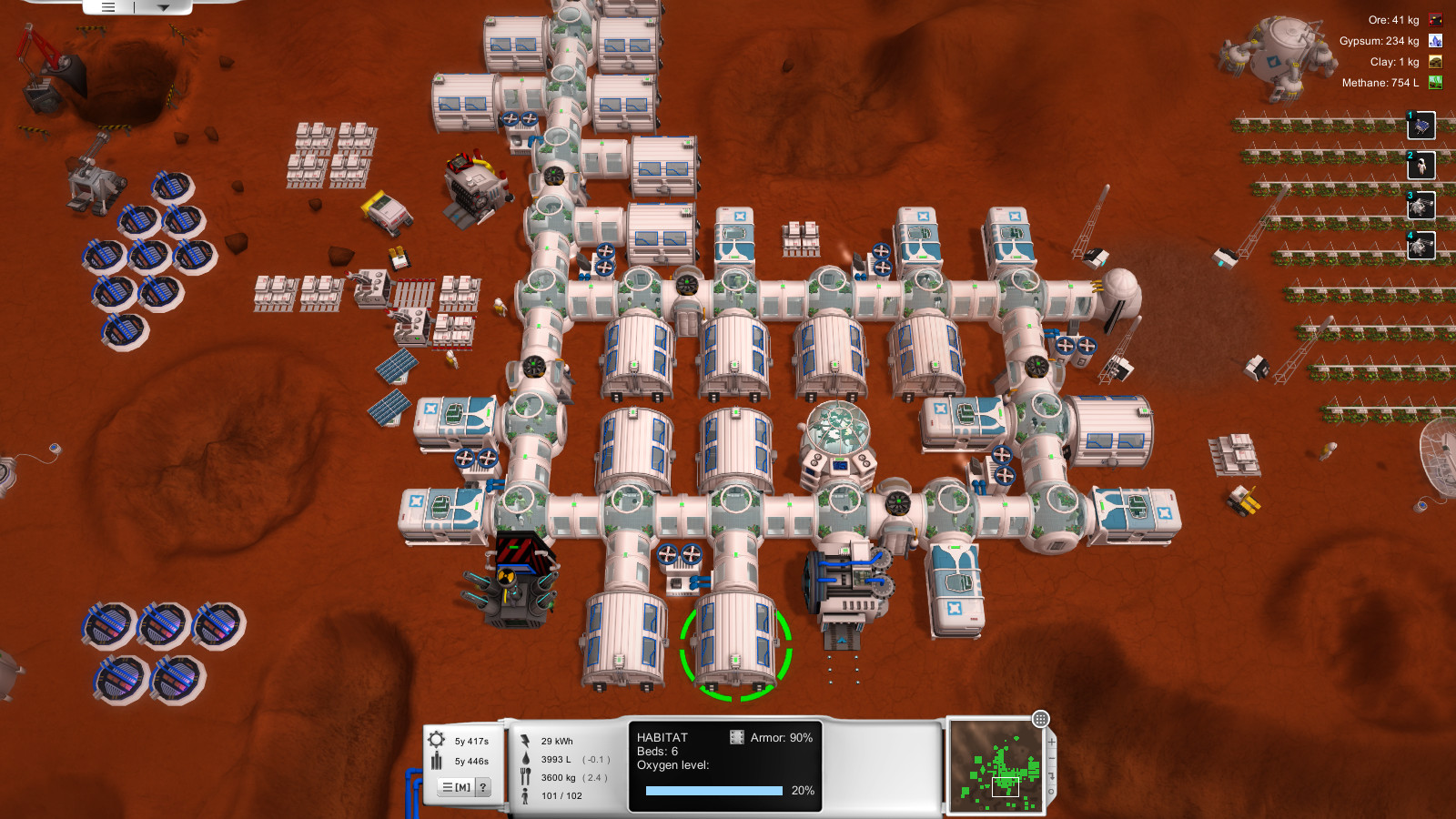


I don't think OutpostHD's graphics need to be that white, but just be white-based. Again, I think this will go well with the survival theme and have a real/gritty NASA base feel to them.

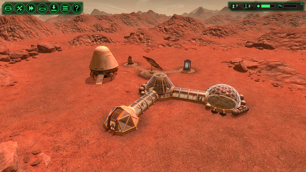
And if I may make a small suggestion about the already-excellent seed lander. The black & white checkerboard pattern feels a bit off to me, and for some reason reminds me of an American roadside diner's walls... And aesthetically I think it will still look better if the ramps are oriented towards the sides of the tile, not the corners. Finally, and this is just my subjective opinion, I think landers look better if that are more rounded and "chubby" like these two landers:



Sorry about jumping on board the thread so late, I just wanted to share some thoughts as an "outsider" new to (but very excited about) this game. Please let me know what you think, and thanks White Claw for the fantastic work!

Offline leeor_net

  • Administrator
  • Hero Member
  • *****
  • Posts: 2352
  • OPHD Lead Developer
    • LairWorks Entertainment
Re: OutpostHD Graphics
« Reply #67 on: August 07, 2017, 04:51:49 PM »
As stated in other threads, input from users of the game is extremely helpful. It gives us a sounding rod to see how we're doing.

Sol 0 is a great game but it's visually very boring. As much as I appreciate realism in games that was one of the problems with Outpost -- they tried too hard to make it realistic and forgot to make a fun game in the process. We have talked about it a bit before -- that if we wanted to be truly realistic with it each structure, at least the first versions, would basically be identical on the outside with different internal arrangements. But that leaves for a very boring looking game and makes it harder for the player to identify structures. Granted you're not saying to go hyper realistic like that but some variety in looks and colors helps to provide a more visually interesting game.

As for the lander, I can agree. The fatter variants are probably more stable anyway.

Figmo -- sounds like we've got ourselves an easter egg. :)

Offline White Claw

  • Hero Member
  • *****
  • Posts: 854
Re: OutpostHD Graphics
« Reply #68 on: August 07, 2017, 07:46:22 PM »
Just wanted to say thanks to White Claw for the amazing graphics work, and wanted to share some thoughts as a newcomer (latecomer?) to OutpostHD.

Thank YOU! :D I certainly appreciate the feedback. I'll try to address much of what's here, but please take it as discussion and not "this is how it is."


As I understand it, the OpenTTD project avoided DMCAs and CnDs by redrawing the sprites from scratch, but they are still extremely similar to the originals. And I'm saying this as someone who played the original TTD to death... So I suspect it's fine even if the original Outpost's graphics are redrawn with minimal changes as well? Not that I am promoting redrawing the original graphics since I think this is a great chance to create new ones, but just FYI.

The original concern that Leeor posted had to do with using the old artwork directly. So I am trying to take the opportunity to make some updates, but trying to also capture the old feel. Additionally, OpenTTD has "high res 32-bpp" graphics packs available for download. I'm not sure if I'll get that far, but yeah...part of the idea is to also make them simply look more updated and current.


IMHO I would suggest a color theme that is white-based so that it looks more like current NASA space habitats (e.g. ISS, Space Shuttle, etc.). More thoughts below.

I could try some concepts out. Perhaps a mild-white base instead of a blue-gray. I'm open to ideas, but also as Leeor said, trying to not end up with something that's visually bland when everything is taken all together. White is certainly more in line with current concepts, but can get rather stark when it covers the landscape.


What about rather than animations (though I agree it would be awesome to have animations!!), we have different versions of the same building to indicate its status. E.g. Online/working vs offline? Or intact vs damaged?

Another good idea. Although I don't know if there will be damage in this game, there would be "active" vs "inactive" buildings. I'm not sure what all would visually change off hand, aside from the lights being turned off.


I love the Figmo. :D

Heh, perhaps I need to give it a more definitive form.


That said, the spiral structure inside the agridome looks rather fancy for such a survival-focused environment. Which leads me to...

For the overall theme of the graphics, I suggest something that looks great but is also highly utilitarian. I think this will fit the survival-theme of the game. If higher level buildings are implemented, then maybe the higher level buildings can have fancier looking graphics?

The agridome structure is intended on being sleek and modern looking. The original OP1 has three tiers of agridome. I haven't gotten to the point of making three yet, but this could easily be a Tier 3 structure. I think, "in reality" the crops would be in high danger inside any kind of glass structure on the surface, exposed to direct radiation and debris.

I agree about the initial buildings needing to feel utilitarian. That was something we were also discussing. Though the trick still comes back to not having every structure look like a pile of concrete with a few minor changes. Tbh, it took quite a bit of thinking to get the command center to not simply be a dome with a couple lights on it.


The black & white checkerboard pattern feels a bit off to me, and for some reason reminds me of an American roadside diner's walls... And aesthetically I think it will still look better if the ramps are oriented towards the sides of the tile, not the corners.

The checkerboard pattern is inspired by the original artwork (not that the original artwork drives the current). So that's the genesis of that particular pattern.


Finally, and this is just my subjective opinion, I think landers look better if that are more rounded and "chubby" like these two landers:

I could give it a try to fatten up the lander a bit. One of the things I'm struggling with on the seed lander is that it supposedly fits four structures, some robots, and four cross-tubes in it. I can make some allowances for in-situ construction, but there's still a lot of equipment that would be on that lander. And from a practical standpoint, the "smaller" lander simply doesn't have much interesting detail to it. I'm not driving for "strict realism," but my own brain needs to have some level of scale commonality or it just makes it harder for me to mentally get through modeling.


Sorry about jumping on board the thread so late, I just wanted to share some thoughts as an "outsider" new to (but very excited about) this game.

You're not really late at all. I think I'm about four buildings into this project, so it's still pretty early on. There's not even a definitive "theme" to the buildings yet. Also...Welcome!


Cheers
« Last Edit: August 11, 2017, 09:39:00 PM by White Claw »

Offline leeor_net

  • Administrator
  • Hero Member
  • *****
  • Posts: 2352
  • OPHD Lead Developer
    • LairWorks Entertainment
Re: OutpostHD Graphics
« Reply #69 on: August 07, 2017, 08:41:22 PM »

What about rather than animations (though I agree it would be awesome to have animations!!), we have different versions of the same building to indicate its status. E.g. Online/working vs offline? Or intact vs damaged?

Another good idea. Although I don't know if there will be damage in this game, there would be "active" vs "inactive" buildings. I'm not sure what all would visually change off hand, aside from the lights being turned off.

I've actually talked about structure deterioration over time and the need for repair crews. I still think these are mechanics I'd like to implement into the game -- as part of the difficulty selection and planet type (e.g., higher difficulty levels cause buildings to deterioirate faster, harsh atmospheres also cause faster deterioration). I hadn't considered an actual change in appearance except for destroyed structures but that's a pretty good idea.

White Claw, if you're up for it as we settle on a design scheme and start getting these buildings out the door if you're up for this it could probably be done simply enough through texturing.

Offline White Claw

  • Hero Member
  • *****
  • Posts: 854
Re: OutpostHD Graphics
« Reply #70 on: August 07, 2017, 08:57:37 PM »
Here's an example of white tubes. I've essentially flipped the colors between the bluish gray and the white.
« Last Edit: August 07, 2017, 11:59:33 PM by White Claw »

Offline White Claw

  • Hero Member
  • *****
  • Posts: 854
Re: OutpostHD Graphics
« Reply #71 on: August 07, 2017, 10:31:23 PM »
And a fatter, squattier variant of the lander. This size needs some rework of the details, but before I spent time I thought I'd ask about how these proportions compare.
« Last Edit: August 08, 2017, 12:05:16 AM by White Claw »

Offline White Claw

  • Hero Member
  • *****
  • Posts: 854
Re: OutpostHD Graphics
« Reply #72 on: August 07, 2017, 10:49:16 PM »
White Claw, if you're up for it as we settle on a design scheme and start getting these buildings out the door if you're up for this it could probably be done simply enough through texturing.

I have some ideas, depending on how you're up for this. Are you thinking of doubling up the graphics, or some sort of transparent "dirty" overlay?


(Sorry for the multi post spam...)

Offline leeor_net

  • Administrator
  • Hero Member
  • *****
  • Posts: 2352
  • OPHD Lead Developer
    • LairWorks Entertainment
Re: OutpostHD Graphics
« Reply #73 on: August 08, 2017, 12:28:01 AM »
Could be done either way -- an overlay or with separate sprites that could even include other damaged geometry. Your choice.

Offline Hooman

  • Administrator
  • Hero Member
  • *****
  • Posts: 4955
Re: OutpostHD Graphics
« Reply #74 on: August 08, 2017, 04:57:29 AM »
I am so happy with the graphics work being done here. This is amazing to see.