Author Topic: Outpost 2 Main Menu Screen in HTML  (Read 10638 times)

Offline Hooman

  • Administrator
  • Hero Member
  • *****
  • Posts: 4954
Outpost 2 Main Menu Screen in HTML
« on: January 09, 2018, 09:12:16 AM »
It's a silly project but why not. Recreating the Outpost 2 main menu screen in HTML. See if you can tell which one is which.


Offline Hooman

  • Administrator
  • Hero Member
  • *****
  • Posts: 4954
Re: Outpost 2 Main Menu Screen in HTML
« Reply #1 on: January 09, 2018, 09:16:33 AM »
Here's a bit about how the project was built.

To start, here is a Minimal HTML Document:
Code: [Select]
<!DOCTYPE html>
<html lang="en">
  <head>
    <meta charset="utf-8">
    <title>title</title>
    <link rel="stylesheet" href="style.css">
    <script src="script.js"></script>
  </head>
  <body>
    <!-- page content -->
  </body>
</html>

From here, set the title, remove the unnecessary script tag, and fill in the body. For the body contents, use a navigation tag to contain the menu, which has a top level header for the menu title, and an unordered list of anchor tag links for the buttons. The links have nowhere to point to, so for now, the href attributes can be set to "#" to keep the links valid.

index.html:
Code: [Select]
<!DOCTYPE html>
<html lang="en">
  <head>
    <meta charset="utf-8">
    <title>Outpost 2</title>
    <link rel="stylesheet" href="style.css">
  </head>
  <body>
    <nav class="menu">
      <h1>Main Menu</h1>
      <ul>
        <li><a href="#">Tutorials</a></li>
        <li><a href="#">New Campaign</a></li>
        <li><a href="#">Colony Games</a></li>
        <li><a href="#">Multiplayer</a></li>
        <li><a href="#">Load Game</a></li>
        <li><a href="#">Game Preferences</a></li>
        <li><a href="#">Help</a></li>
        <li><a href="#">About Outpost 2</a></li>
        <li><a href="#">Quit</a></li>
      </ul>
    </nav>
  </body>
</html>

That completes the HTML structure. It doesn't look like much yet. A CSS stylesheet still needs to be added to make it look like the final output.

"Unstyled Menu"
« Last Edit: January 09, 2018, 09:43:10 AM by Hooman »

Offline leeor_net

  • Administrator
  • Hero Member
  • *****
  • Posts: 2350
  • OPHD Lead Developer
    • LairWorks Entertainment
Re: Outpost 2 Main Menu Screen in HTML
« Reply #2 on: January 09, 2018, 09:23:48 PM »
Image 2 is HTML version. It's shockingly close to the original. Nicely done. :D

Offline Hooman

  • Administrator
  • Hero Member
  • *****
  • Posts: 4954
Re: Outpost 2 Main Menu Screen in HTML
« Reply #3 on: January 10, 2018, 04:06:07 AM »
And how can you tell? I know of about 7 differences off the top of my head.

I'll cover some of the CSS rules in a bit. Still organizing how to present it.

Offline Goof

  • Jr. Member
  • **
  • Posts: 57
Re: Outpost 2 Main Menu Screen in HTML
« Reply #4 on: January 10, 2018, 11:25:37 AM »
I tried and it seems to be good.
Only CSS, I used your html as is.
As i haven't the image, I just dug one out of internet to fill the space ... with a space-station in space

« Last Edit: January 10, 2018, 01:12:28 PM by Goof »

Offline Hooman

  • Administrator
  • Hero Member
  • *****
  • Posts: 4954
Re: Outpost 2 Main Menu Screen in HTML
« Reply #5 on: January 10, 2018, 01:21:01 PM »
Hah, very nice! That's actually quite a beautiful image.

Offline lordpalandus

  • Banned
  • Hero Member
  • *****
  • Posts: 825
Re: Outpost 2 Main Menu Screen in HTML
« Reply #6 on: January 10, 2018, 05:44:11 PM »
The biggest differences I notice between the two, is that image two has slightly brighter colors than the first image. Compare the glowing teal strips on the habitat ring to eachother. Also notice that the image is less hazy as well; look at the bottom left corner and compare the planet atmospheres to eachother.

Also, I kind of like the space station image more for Outpost 2 than the Outpost 2 starship. Where did you get that image; I want to use it as my wallpaper!
Currently working on Cataclysm of Chaos, Remade.
Link to OPU page = http://forum.outpost2.net/index.php/topic,6073.0.html

Offline leeor_net

  • Administrator
  • Hero Member
  • *****
  • Posts: 2350
  • OPHD Lead Developer
    • LairWorks Entertainment
Re: Outpost 2 Main Menu Screen in HTML
« Reply #7 on: January 10, 2018, 06:48:21 PM »
Anti-aliasing is the dead giveaway.

Offline Goof

  • Jr. Member
  • **
  • Posts: 57
Re: Outpost 2 Main Menu Screen in HTML
« Reply #8 on: January 10, 2018, 06:51:38 PM »
I used this one from pinterest
https://i.pinimg.com/originals/92/8c/9a/928c9af759f2710fa8cb0c01d58ec837.jpg

I like also this one : http://www.misucell.com/WDF-317458.html
the planet is cool maybe flipped left/right to keep the tower at the opposite of the menu

And this one : http://www.misucell.com/WDF-317446.html
seems to be Eve Online ships look more like an exodus like in BattleStar Galactica.
« Last Edit: January 11, 2018, 02:29:57 AM by Goof »

Offline Hooman

  • Administrator
  • Hero Member
  • *****
  • Posts: 4954
Re: Outpost 2 Main Menu Screen in HTML
« Reply #9 on: January 11, 2018, 07:30:37 AM »
Quote
The biggest differences I notice between the two, is that image two has slightly brighter colors than the first image. Compare the glowing teal strips on the habitat ring to eachother. Also notice that the image is less hazy as well; look at the bottom left corner and compare the planet atmospheres to eachother.

Wow, good eye. I assume you downloaded the images and were swapping back and forth between them? That's the only way I was able to notice such things.

You're right about the image intensities being different. I extracted the bitmaps from the game and converted them to PNG. When I compare the bitmap and the PNG in an image viewer, they are identical, but when loaded in the browser, the PNG gets color corrected, which gives it a brighter more vibrant appearance. I read into color spaces and tried tweaking the PNG header but was unable to prevent the color correction.

I noticed the brightness difference first with the planet. I though it was my imagination or the viewing angle on the LCD, but soon came to realize the images really were different. When I started playing with PNG headers, and swapping back and forth between different versions, I began to see a very noticeable shift in the atmospheric haze surrounding the planets. I also began noticing the shadows seemed to move on the space station, as the correction at the transition point between light and dark was quite noticeable. I have trouble seeing much change with the teal though. I find that's a very minor shift. You're right though, there is a bit of change there.

Quote
Anti-aliasing is the dead giveaway.

Interesting, and good eye. Both images actually have some anti-aliasing, though there is one spot in particular where they differ, where one image doesn't use anti-aliasing. There is however another difference in that same area, which I would have thought was more noticeable, though at the same time, also not easy to tell which one is which.
« Last Edit: January 11, 2018, 04:50:14 PM by Hooman »

Offline lordpalandus

  • Banned
  • Hero Member
  • *****
  • Posts: 825
Re: Outpost 2 Main Menu Screen in HTML
« Reply #10 on: January 11, 2018, 08:58:45 PM »
Actually I just took a look at the two pictures, without downloading them.

The antialiasing is most obvious by looking at the red line corners right above where it says "Main Menu". The original has a visible gap, but the new one doesn't.

Currently working on Cataclysm of Chaos, Remade.
Link to OPU page = http://forum.outpost2.net/index.php/topic,6073.0.html

Offline leeor_net

  • Administrator
  • Hero Member
  • *****
  • Posts: 2350
  • OPHD Lead Developer
    • LairWorks Entertainment
Re: Outpost 2 Main Menu Screen in HTML
« Reply #11 on: January 11, 2018, 10:20:56 PM »
It was the anti-aliasing for the MAIN MENU text that was the giveaway for me. I noticed some differences in the frame corners but the original game doesn't anti-alias the MAIN MENU text, probably due to the font that was used (it appears to be one of the built-in windows raster fonts). The button text seems to be using a true type font so even the original game displays them anti-aliased.

Offline lordpalandus

  • Banned
  • Hero Member
  • *****
  • Posts: 825
Re: Outpost 2 Main Menu Screen in HTML
« Reply #12 on: January 12, 2018, 01:25:12 AM »
Good eye.

Also the text for Tutorials is slightly bigger in the first image than in the second image. By about 1-2 pixels.
Currently working on Cataclysm of Chaos, Remade.
Link to OPU page = http://forum.outpost2.net/index.php/topic,6073.0.html

Offline leeor_net

  • Administrator
  • Hero Member
  • *****
  • Posts: 2350
  • OPHD Lead Developer
    • LairWorks Entertainment
Re: Outpost 2 Main Menu Screen in HTML
« Reply #13 on: January 12, 2018, 10:23:35 AM »
Different fonts. :)

Offline Hooman

  • Administrator
  • Hero Member
  • *****
  • Posts: 4954
Re: Outpost 2 Main Menu Screen in HTML
« Reply #14 on: January 13, 2018, 11:51:13 AM »
Indeed, the fonts are different. The was perhaps the biggest difference I was unable to resolve. I thought it might be Arial, but that didn't quite match up. I did some digging through resource files and old default settings to find out what fonts were used. Windows had an old default of "MS Sans Serif", which I saw referenced in the resource data. This font derives from an older font known as "Helv", and is similar to Helvetica and Arial, all within the sans-serif family of fonts.

I looked for a copy of the "MS Sans Serif" font. I came across a copy of MS Sans Serif Regular as a True Type font (micross.ttf). The menu screen used a bold font. Turns out True Type fonts use different font files for regular versus bold versus italic. When using the regular .ttf file in Chrome on Linux with CSS, the bold setting was ignored. As this was an early font, there was no separate bold or italic files. Windows derived those from the regular font algorithmically. No idea how the algorithm worked, and my initial attempts at converting the regular font to a bold font using Font Forge didn't work out satisfactorily. After burning way too much time on such a trivial difference, I eventually just went with one of the related fonts. Not pixel perfect, but close enough to give the same feel.

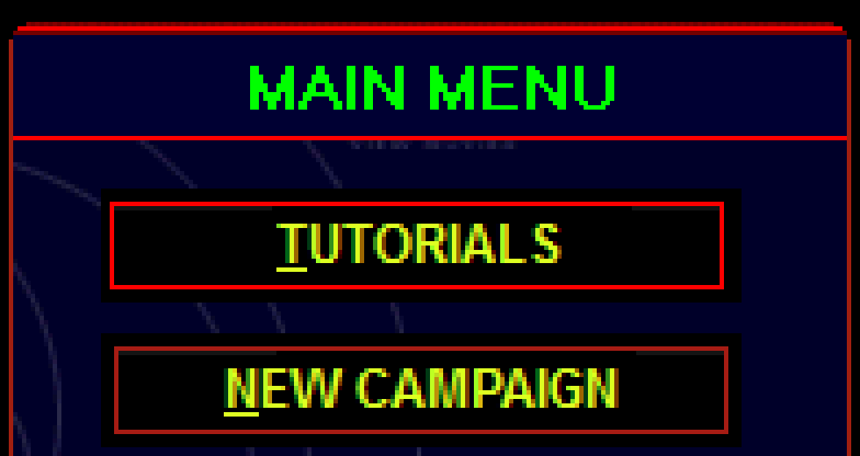
Maybe someone using Windows would have better luck setting the font? Also, I think the "MS Sans Serif" only applied to the buttons, not the header, hence the aliasing difference.


Here's an enlarged view so you can see things easier. The header font is jagged, with no anti-aliasing. The button font is smoothed.


I also played around with the top border. I always thought it looked clipped, but it is actually rounded, just jagged, no anti-aliasing, and with a gap in color. It uses a 3 line border, with the top line alternating between two colors. The color lines stay straight, and are successively trimmed at the rounded corners. I found the varying colors and nature of the corner rounding not very amenable to CSS, so it got approximated with a 2 line border, no color alternation, and different rounding between inner and outer lines to get a more jagged color overlap look.

I also noticed a faint grey line at the top of buttons, just inside the red border. It doesn't go all the way across, and the length is asymmetric between the two sides. As it's so hard to see, I didn't feel it was worth trying to replicate.

Also, something I could have done, but forgot. The active button has the red highlight border shifted 1 pixel up and left.
« Last Edit: January 13, 2018, 11:57:01 AM by Hooman »

Offline White Claw

  • Hero Member
  • *****
  • Posts: 854
Re: Outpost 2 Main Menu Screen in HTML
« Reply #15 on: January 13, 2018, 02:03:00 PM »
Pretty neat how close you were able to get.

I know the intent was to spot the differences...but I wanted to say that this is a really awesome look, right here.


Maybe at some point I'll have enough skill to make CG stuff like this, and we can add some backdrops and such to OPHD and/or OP2. :D

Offline Hooman

  • Administrator
  • Hero Member
  • *****
  • Posts: 4954
Re: Outpost 2 Main Menu Screen in HTML
« Reply #16 on: January 24, 2018, 02:39:09 PM »
A few more details about the project.

To extract the background images from Outpost 2, I used Resource Hacker. It's a Windows program, but luckily for me it can run on Linux under Wine. The images were stored in op2shres.dll. I assume the name stands for "Outpost 2 Shell Resources".


Using .bmp files is not supported by most browsers, so I converted the images from .bmp to .png using the Image Magick convert command:
Code: [Select]
convert screenshot.bmp screenshot.png


The rest was the following CSS:
Code: [Select]
html, body {
  margin: 0px;
  padding: 0px;
  /*
  width: 640px;
  height: 480px;
  */
}
body {
  background: #000 url(space-station.png) center no-repeat;
  height: 100vh;
}

.menu {
  border-radius: 5px 5px 0px 0px;
  border: 1px solid #a01f10;
  border-top-color: #a01f10;
  border-bottom-color: #fc0000;
  background: #000029;
  float: right;
  margin: 20px 20px;
  font-family: Arial, sans-serif;
  font-size: 11px;
  font-weight: bold;
  text-transform: uppercase;
  text-align: center;
}
.menu h1 {
  font-size: 1.35em;
  border-top: 1px solid #fc0000;
  border-bottom: 1px solid #ff0000;
  color: #0f0;
  margin: 0px;
  padding: 5px 3px 3px;
}
.menu ul {
  border-bottom: 1px solid #a01f10;
  background: #000029 url(menu-background.png) center no-repeat;
  margin: 0px;
  padding: 5px 3px 18px;
}
.menu ul li{
  background: #000;
  list-style: none;
  padding: 3px;
  margin: 6px 21px 6px 17px;
}
.menu a {
  display: block;
  border: 1px solid #a61c14;
  padding: 3px 10px;
  color: #df2;
  text-decoration: none;
}
.menu a::first-letter {
  text-decoration: underline;
}
.menu a:focus {
  outline: 0;
  border-color: #fc0000;
}
.menu a:active {
  box-shadow: 0px 0px 10px 2px #a61c14;
}


I was originally planning on breaking down the CSS into groups of changes, with screenshots along the way. Though I've been dragging my feet about it. The screenshots turned out to be a fair bit of work to do manually, and a pain to redo when I messed up or wanted to change something. I figure I should stop dragging my feet trying to writeup a perfect presentation, and just post the code in its final form. If people have questions, or want a more detailed breakdown, I can add that later.

Meanwhile though, the attempt did allow me to develop a script to make automated screenshots of a series of Git commits. I figure that may be worth posting about in it's own right.

Offline leeor_net

  • Administrator
  • Hero Member
  • *****
  • Posts: 2350
  • OPHD Lead Developer
    • LairWorks Entertainment
Re: Outpost 2 Main Menu Screen in HTML
« Reply #17 on: January 24, 2018, 09:52:40 PM »
Side note about Resource Hacker -- be careful which one you're downloading. There is/was a compromised version of their website that led to malware or at the very least very similar software masquerading around as this one. Use the link Hooman provided, that's the real one.