Just wanted to say thanks to White Claw for the amazing graphics work, and wanted to share some thoughts as a newcomer (latecomer?) to OutpostHD.
First of all:
1) Is there a desired style/theme in mind? Is this a recreation of original OP graphics, or a reimagined version...or something else.
Ideally a reimagining. As much as I seriously doubt any IP DMCA notices will come through, I'd like to avoid any potential CnD's.
As I understand it, the
OpenTTD project avoided DMCAs and CnDs by redrawing the sprites from scratch, but they are still
extremely similar to the originals. And I'm saying this as someone who played the original TTD to death... So I suspect it's fine even if the original Outpost's graphics are redrawn with minimal changes as well? Not that I am promoting redrawing the original graphics since I think this is a great chance to create new ones, but just FYI.
2) Is there a desired color scheme?
I'm slightly color blind and not great at designing visuals... I would say I leave this up to the developer. It would make sense to probably stick with a high tech somewhat neutral color scheme but that could lead to something very visually bland. So... I would say, I leave that up to the artist. 
IMHO I would suggest a color theme that is white-based so that it looks more like current NASA space habitats (e.g. ISS, Space Shuttle, etc.). More thoughts below.
3) Any animations?
Animation would be awesome but I'm generally not expecting it because of the amount of work involved in it. The only things I'd really like to see for sure animated are the robots.
What about rather than animations (though I agree it would be awesome to have animations!!), we have different versions of the same building to indicate its status. E.g. Online/working vs offline? Or intact vs damaged?
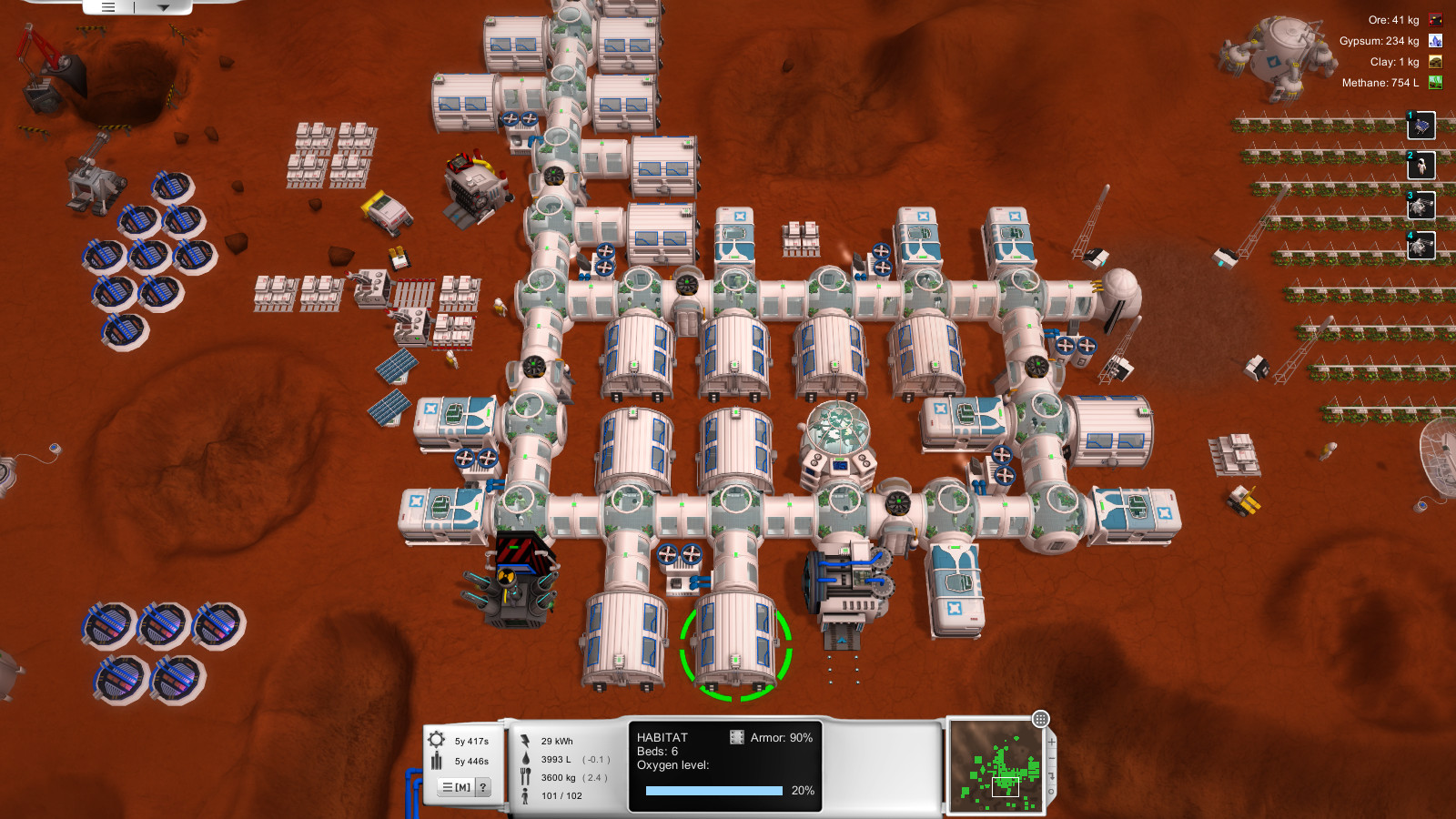
Secondly:I love the Figmo.

I also love the construction site tile and the sphere agridome. That said, the spiral structure
inside the agridome looks rather fancy for such a survival-focused environment. Which leads me to...
For the overall theme of the graphics, I suggest something that looks great but is also highly utilitarian. I think this will fit the survival-theme of the game. If higher level buildings are implemented,
then maybe the higher level buildings can have fancier looking graphics?
Along the same lines, I've been browsing through some colony-building games on Steam such as
Unclaimed World,
Planetbase, or
Sol 0. To be clear, I was looking at their graphics not gameplay (in fact, I've never really played those games).
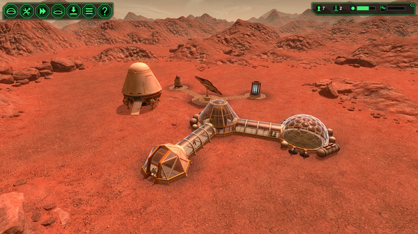
I think the following image illustrates the "white-based" color scheme well:
I don't think OutpostHD's graphics need to be that white, but just be white-based. Again, I think this will go well with the survival theme and have a real/gritty NASA base feel to them.
And if I may make a small suggestion about the already-excellent seed lander. The black & white checkerboard pattern feels a bit off to me, and for some reason reminds me of an American roadside diner's walls... And aesthetically I think it will still look better if the ramps are oriented towards the sides of the tile, not the corners. Finally, and this is just my subjective opinion, I think landers look better if that are more rounded and "chubby" like these two landers:

Sorry about jumping on board the thread so late, I just wanted to share some thoughts as an "outsider" new to (but very excited about) this game. Please let me know what you think, and thanks White Claw for the fantastic work!

