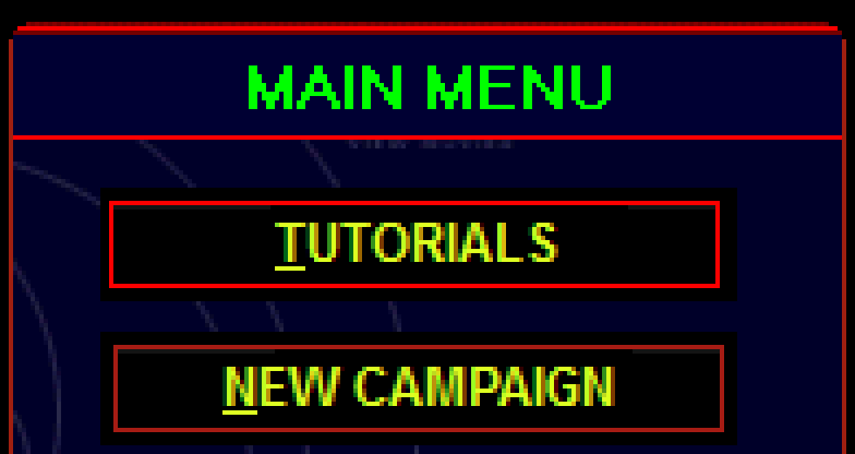
Indeed, the fonts are different. The was perhaps the biggest difference I was unable to resolve. I thought it might be Arial, but that didn't quite match up. I did some digging through resource files and old default settings to find out what fonts were used. Windows had an old default of "MS Sans Serif", which I saw referenced in the resource data. This font derives from an older font known as "Helv", and is similar to Helvetica and Arial, all within the sans-serif family of fonts.
I looked for a copy of the "MS Sans Serif" font. I came across a copy of MS Sans Serif Regular as a True Type font (micross.ttf). The menu screen used a bold font. Turns out True Type fonts use different font files for regular versus bold versus italic. When using the regular .ttf file in Chrome on Linux with CSS, the bold setting was ignored. As this was an early font, there was no separate bold or italic files. Windows derived those from the regular font algorithmically. No idea how the algorithm worked, and my initial attempts at converting the regular font to a bold font using Font Forge didn't work out satisfactorily. After burning way too much time on such a trivial difference, I eventually just went with one of the related fonts. Not pixel perfect, but close enough to give the same feel.
Maybe someone using Windows would have better luck setting the font? Also, I think the "MS Sans Serif" only applied to the buttons, not the header, hence the aliasing difference.
Here's an enlarged view so you can see things easier. The header font is jagged, with no anti-aliasing. The button font is smoothed.

I also played around with the top border. I always thought it looked clipped, but it is actually rounded, just jagged, no anti-aliasing, and with a gap in color. It uses a 3 line border, with the top line alternating between two colors. The color lines stay straight, and are successively trimmed at the rounded corners. I found the varying colors and nature of the corner rounding not very amenable to CSS, so it got approximated with a 2 line border, no color alternation, and different rounding between inner and outer lines to get a more jagged color overlap look.
I also noticed a faint grey line at the top of buttons, just inside the red border. It doesn't go all the way across, and the length is asymmetric between the two sides. As it's so hard to see, I didn't feel it was worth trying to replicate.
Also, something I could have done, but forgot. The active button has the red highlight border shifted 1 pixel up and left.
